
Designing might sound like a hassle-free job, but in reality, the process is not as simple as it might look like. Since there’s no established formula or algorithm for getting the right results and products, designing can be a bit daunting.
Although there are principles and rules which the designers should adhere to, it still depends on the designer whether he wants to follow the break free or stick with the Holy Grail.
Learn more: How To Create A Compelling Visual Hierarchy For Your Website?
Website design is a complicated topic, and when it comes to deciding which elements constitute the right design, the answer to that question varies from person to person.
Where most people prefer sleek design and modern-day interfaces, others might prefer simplicity and proper functionality over all that visual and graphic elements.
The selection of the right approach depends largely on the nature and industry niche of your business and brand. Whichever route you choose, make sure that the website is user-friendly and helps in turning the visitors into potential and loyal clients and customers.
Even a simple mistake can have adverse effects not only on the overall web design but also on its user-friendliness.
Using high-quality graphics and visually-appealing illustrations and animations to add texture and consistency to your website is not enough to build an impressive website.
For that, you need an interactive framework to make your website responsive and engaging. When it comes to a stunning website, simplicity is the first and most-practiced principle of website designing.
Whether you work at any successful whiteboard animation company and designing agency or as a freelance web designer, following the principles of designing is the key to become a renowned designer.
In this online world, where the internet is filled with hundreds of thousands of websites and web spaces, almost every website has similar elements and features.
Factually, text, images, and colors form the core of web design. Once you have selected all these elements, the rest of the designing process becomes much easier.
Read more: What Are The 5 Popular Use Cases of React Js?
Then, all you have to do is to apply, stretch, structure, code, and mix these basic elements—and that’s when real design issues start to surface.
The webspace is filled with tons of well-designed and exceptionally structured websites that manifest business values, objectives, and culture in the best possible way.
While on the other hand, some chaotic and hilariously appalling websites are the culprit of committing all the reprehensible and unacceptable designing sins.
Such websites are not just slow, but they are the bearers of every web bugbear. Since the designing website is not a simple task, anyone can fall for these traps, and there’s no excuse for it.
Be it Facebook or Google; all these websites have some designing quirks and oddities, which numerous people find annoying.
Here are a few of the cardinal sins that many companies commit, which not only reduces their site’s traffic but also decreases their growth and sales rates.
So pay close attention to all these traps and decoys because any integration of one of them can turn your exceptionally developed website into a horror show for the targeted audience and potential business prospects.
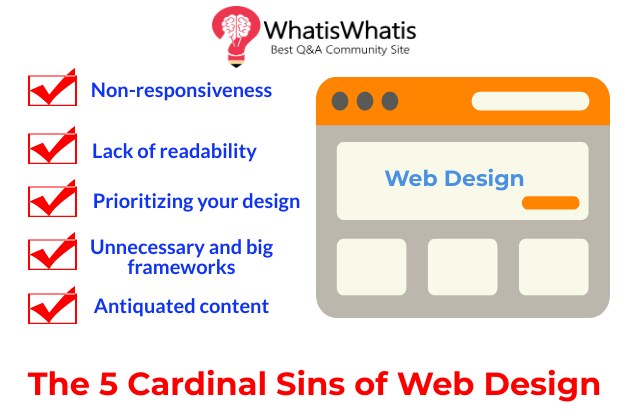
What are The 5 Cardinal Sins of Web Design?
Mistake #1: Non-responsiveness:
A non-responsive site is a big no-no in this internet-driven world. Ever since the introduction of concepts like mobile marketing and online shopping, smartphones and smart-devices have become the driving force of online traffic.
In the hyper-connected world, filled with hundreds of devices and gadgets, failure to build a responsive and easy-to-use and navigate website can drive the traffic away from your site.
Thus, increasing the bounce rate of your online content and reducing the organic flow of traffic. A well-developed and responsive website is not only navigable, but it also adds consistency to your design and delivers adaptability to the users.
A non-updated and non-optimized website can have several problems like loading time, quality of the images, and other graphical elements, the layout of the whole interface, restricted and poor seamless responsiveness on every digital and internet-powered device.
The efficient translation of content from one device to another is what makes your website responsive and user-friendly.
Mistake #2: lack of readability:
To make an ideal website, readability is one of the chief concerns of the web designers and developers.
A well-developed website consists of good typography, appropriate font style, and size, proper line length and height, great usage of different colors and fonts, and well-thought-out grid lines.
To enhance the readability of balancing the text with the graphical and visual elements is of key importance. The visual hierarchy, coupled with proper placement, is what impacts the visual appeal of the whole website.
Read more: Reasons Why Your Website Needs Redesigning Urgently
Based on the selected typeface and typographic style, the line-height of your design layout should be appropriate for the textual content and part of the design.
Where text and lines form the core of a great design, colors are the cornerstone of what is usually known as stunning website design.
What can be easier than filling colors in some white empty spaces, right? No, wrong! With tons of options and a plethora of multitudes of shades and different tones of colors choosing the right one and making the best combination is nothing like filling your coloring book with various colors.
It sounds simple, but there are numerous ways that this one trap can make you a design-sinner. Balance out the light and the dark colors and shades of your site. Poor contrast and background shades can reduce the legibility and affect the neatness of your design look.
The overabundance of colors got you worried? Well, then fonts are going to add a little more to your anxieties. With hundreds and thousands of fonts available and easily accessible, choosing the right ones to form the perfect combination can be daunting at times.
Many designers have been guilty of using one too many fonts in the same web design. Scale down the number of fonts in your web design to 2. It is rightly said too much of good things is a bad thing, which in this case infers to the usage of too many good fonts can have adverse impacts on the web’s readability and design’s legibility.
Mistake #3: prioritizing your design
One of the sure-fire ways of getting increased traffic on your website is to prioritize what a customer wants and needs. Regardless of how visually appealing your website design is, if it is not easy to navigate and the content is not well-structured, the viewers and targeted audience are most probably going to switch to another website.
Structuring your website as the audience’s usability and ease-of-use is of key importance. Fundamentally, a website should not be difficult to sue and browse.
Make all the important and relevant information easy to access and find. An intricate design is what sends your users and targeted audience on a wild goose’s chase, which has never resulted in increased site’s ratings and traffic.
Draft out your website design, brainstorm content ideas, discuss your ideas with your team and managers, acquire all the relevant information beforehand, and start designing.
It is significant to put user’s demands before your design requirements. Determine the factors which drive more users towards a web, decide the proper places of headers, text, and all the graphical elements, and make design simplicity your first preference.
Mistake #4: Unnecessary and big frameworks:
Learning big and latest frameworks is of crucial importance for every web designer, but that doesn’t mean that every website should be based on those frameworks.
One of the biggest mistakes that many website designers make is the usage of complex frameworks for every design.
Why make things complicated when a simple static site is faster and better than the one designed multiple dependencies and coding complexities.
Writing up codes for bigger and complex projects and sites can be challenging, as you have to meet every user and design requirement while keeping simplicity intact.
Modern frameworks are indeed the advanced way of achieving success in web designing, but why complicates things when a simple framework can do just the task without any hassles and learning efforts.
In some cases, it is completely fine to abandon frameworks and write the whole web design code from scratch.
Most of the designers prefer to go for this option, as writing the whole code empowers the designers with more control over the whole designing phase, and the outcome is an exceptional code with fewer dependencies and easier to understand the codebase.
Mistake #5: antiquated content:
A great design layout, coupled with functional, comprehensive, and accurate information is a designing plus. Good and updated content is what sets your website apart.
Outdated content is not only misrepresentative, but it reduces the interest of potential customers and clients in your products and services.
A well-built website with a great framework, highly-functional features, and great overall design layout and high-quality and well-composed content are the key ingredients necessary for making a website successful.
A poor-quality and outdated content is not just a quality diminisher, but it also drives away the audience and discourages the first-time visitors.
You might have a well-designed website, but a design won’t sell itself. For that, you need clear, relevant, updated, and keyword-rich content. Use taglines and slogans to make your content customer-centric.
The taglines should not only advertise the products and services; rather, they should deliver the values, purpose, and propositions to the targeted audience and the potential business prospects.
The content on your site holds power to change the perspectives and is the driving force that can either bring masses to your site or could drive away from the new and current clientele and loyal customers—it’s all up to you how you leverage this power and use it for your own benefits and profits.
Endnote:
The world of web designing has never been that easily accessible yet competitive than ever before. With the introduction of modern DIY tools and innovative applications, the competition in this industry has escalated in recent years.
Read more: Why Businesses Should Switch to Cloud-Based Applications?
Looking for a sin-free online web designing tool or a website builder has become the priority of many businesses and companies.
Author Bio: Colors and designs were the first passion that I had. It took me years to become a master of this art. With 4 years of experience in the industry of animation and serving as a senior creative artist at Animation Dok, I am also playing my part in promoting the field through my posts and blogs.


Leave a comment